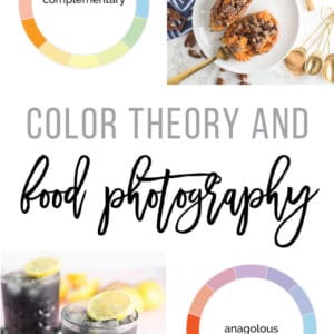

It can be overwhelming thinking about styling and composition when it comes to food photography, but with a little bit of color theory, we can simplify the process.
what is color theory?
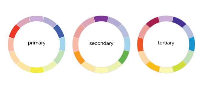
Color theory is the guideline or design principles of color mixing. There are the primary color wheel, secondary color wheel, and tertiary color wheel.
- Primary – red, blue, yellow
- Secondary – purple, green, orange
- Tertiary – a combination of the primary and secondary colors
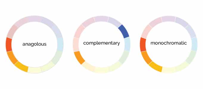
Within these color wheels, we can make educated guesses on what colors will look good together. There are complementary colors and analogous colors.
- Complementary – colors opposite of each other on the color wheel
- Analogous – colors next to each other on the color wheel
- Monochromatic – tints and shades of the same color (ie. pink is a tint of red)
How does this relate to food photography?
When I am shooting food, I first think of the primary color of the food I’m shooting. For example, a sweet potato is orange.
From there, I think of prop colors (i.e napkins and backgrounds) that go with the primary food color.
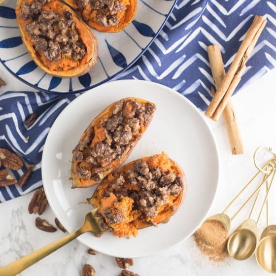
These twice baked sweet potatoes are an example of a complementary color scheme because orange and blue are opposite of each other on the color wheel.
notice the fork and measuring spoons are gold which is monochromatic (similar color) to the potatoes.
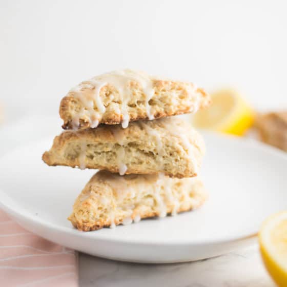
These vegan lemon scones are an example of an analogous color scheme because yellow and pink are next to each other on the color wheel.
What if a food is brown or neutral?
Sometimes foods can be brown, tan, or neutral in color. In this case, I like to use some color to make the food “pop” a bit.
- If a savory food is brown or white (like mashed potatoes), try adding parsley or other herbs for some color
- If a sweet food is brown (like oatmeal) try adding fresh fruit for a splash of color
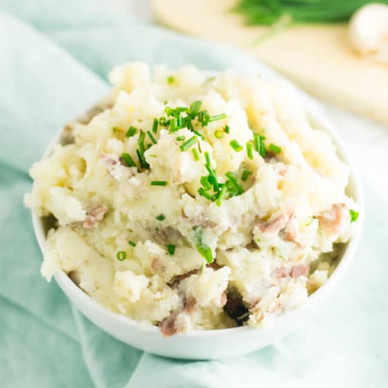
For these vegan mashed potatoes, I garnished the bowl with chives and then used a light blue napkin for an analogous color scheme. Even though the food is white, the napkin and garnish bring the composition together.
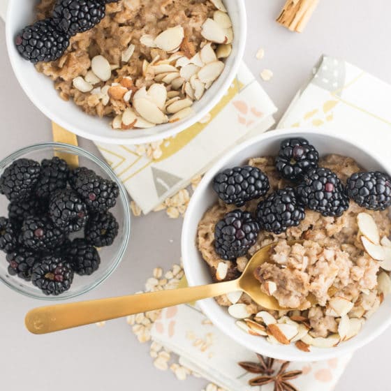
In this photo of slow cooker oatmeal, the oats are brown but I added blackberries to add a bit of color. From there, I used a light purple background and napkins with hints of pints and greens to create this analogous composition.
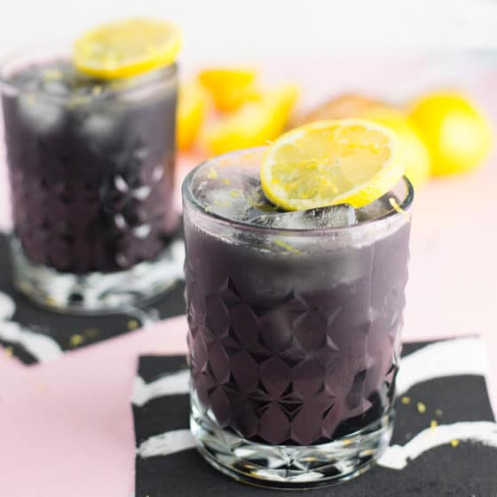
This charcoal lemonade is black but the flavors of lemonade are yellow. So I decided to use a pink background and garnish with lemons, again, to create an analogous composition.
What if the food is colorful?
Being a plant-based food blogger, a lot of my recipes are colorful! So what if I have a super colorful salad where there is not one single color of focus?
Use neutral props!
It’s important to not take away from the subject.
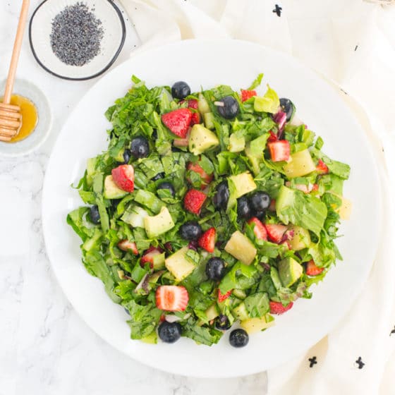
For this berry salad, the subject is so vibrant and colorful, that I balanced it with a white background and white napkin. This allows the salad to really stand out.
Alternatively, I would use a soft yellow, pink, or even blue to complement the fruit in the salad. Anything too bright would take away from the salad though.
In Summary,
- Think of the main color of the food you are shooting
- Choose props that are either complimentary (opposite) or analogous (similar) to the subject
- Neutral foods can get bright or colorful props and backgrounds
- Colorful foods can get neutral or light backgrounds and props
I hope you found these food photography tips useful!
source: 99 Design
Related:
Food Photography Composition: Rule of Thirds
3 Best Angles for Food Photography
Color Theory for Food Photography
My Top 2 Camera Lens for Food Photography
What’s your favorite process when choosing color schemes for food photography?
This is a great article! I have a bit of a color background professionally but hadn’t thought of using what I already know to complement my food photos. Thanks for sharing this 🙂
Great to hear Megan! Glad this helped you!
What are theories that governs food colouring and food flavours
I’m not quite sure what you mean. Can you please elaborate?
Thanks its helped me so much, now my photos are much better. I did not know much about the color that fits together, now it is more clear for me. If you want to see my photos see my blog chillytime.net.
So glad to hear Nikola!